Building the grid
The puzzle grid in Warden's Lantern was almost a hex grid, almost a pointy-top hex grid, and almost isometric. Here's why we settled on boring squares.
Puzzle games have a long history of being clever about their grids. Hex grids feel organic. Pointy-top hexes have charming movement. Isometric grids are beautiful and impossible to actually draw on. We tried all three for Warden's Lantern, and we're shipping squares.
Why we kept trying to be clever
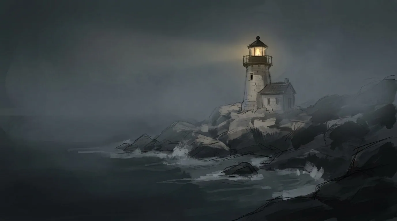
The original reason was aesthetic. A lighthouse is round. A square grid looked wrong next to round walls. A hex grid at least had a six-sided rhythm that felt closer to a circle.
Then we tried to actually do puzzles on hexes, and every hex is a branching decision. With light, that means every mirror has three output directions by default. It was too much — puzzles became fiddly and the player had to track too many beams.
Why squares won
Four directions is the right number for light puzzles. It's enough to surprise you without turning every tile into a knot. It also lets us cheat the round walls — we put the grid inside the round room, not onto it. The floor is square; the walls aren't. Nobody noticed in playtests.
What the grid is
Each cell is a 48×48 px tile at 1× scale, with a conductor type (floor, mirror, lens, shutter, lamp, window) and a state (idle, lit, broken). The lighthouse is one scene; each chapter is a sub-grid inside it.
Next month: the journals. We're still scared of them.